

trope wines is a concept project from naming strategy thought brand execution.
Candidly, I’m not much of a romance reader - but I’ve seen the power of “book-tok” and building a brand for a specific community.
The name:
trope is a nod to the core target audience for the brand, while being generic enough to avoid alienating secondary audiences and on shelf. The name is short, easy to pronounce and has a strong “p” - a sound called a plosive that can enhance memorability and impact.
additionally trope, in it’s dictionary definition, is a significant or recurring theme, which echos the underlying model of curated wines that are true to varietal style.

The wordmarks:
the logo and secondary mark are a modern typeface that I drew over to create a subtly wonky text logo. It breaks the “perfect” nature of the type, bringing a hint of approachability to the text and the brand.

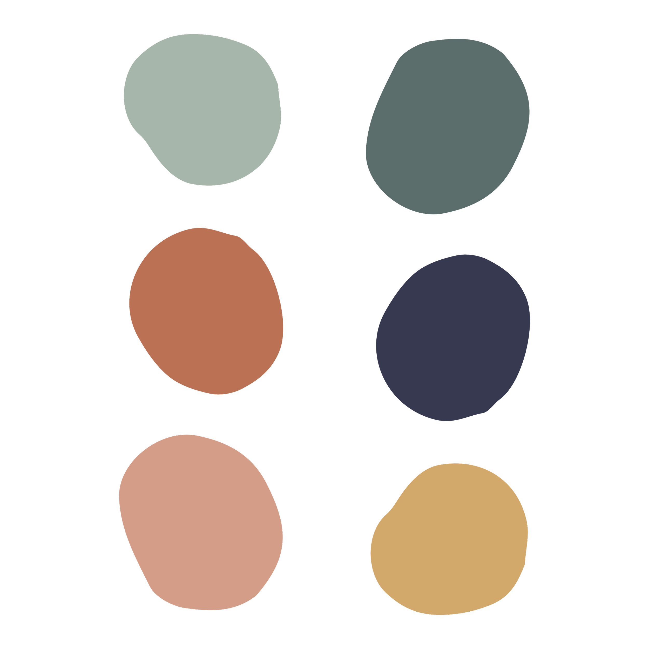
The color palette:
I chose a bolder color palette for the brand for several reasons. First, I think wine is due for some bolder colors. I’m starting to see a bit more color in smaller labels, but the larger brands are still dominated by predominantly white background labels. Second, a bold colorful palette echoes the style that is increasingly popular for contemporary fiction and romance novels.
Brand Strategy Deck
This deck is designed for brand planning at the distributor level, provides information the sales team needs to pitch chain and independent retailers, and provides an outline for brand marketing execution that each tier can use to activate.
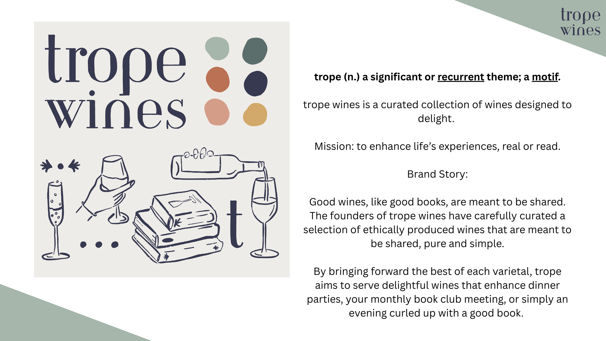
While the brand story starts the founders mission, it centers on the problem to be solved. Consumers are often unsure of what wine to bring, serve, or share when they’re not super familiar with the category. By promising a collection of ethically produced wines, trope not only creates a positive experience but alleviates a pain point for consumers.
The brand story uses verbiage like “aims” and “serves” to subtly position the brand as the guide in the story (leveraging the Story Brand method). The brand also uses words that create connection to the core target audience of readers - and spells out occasions when they’re likely to be consuming wine.
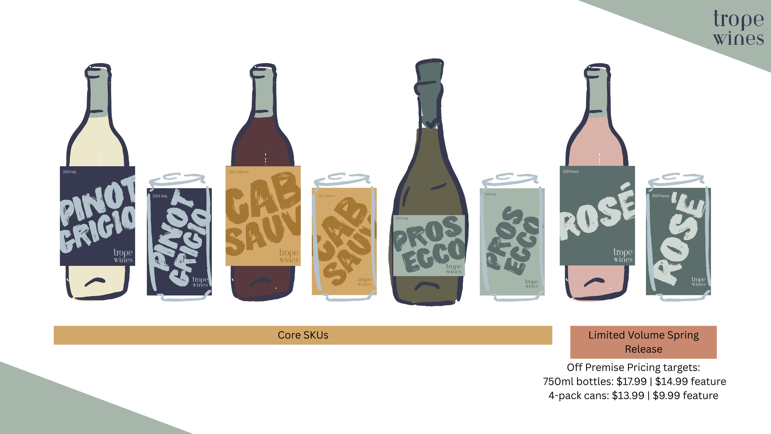
Let’s talk labels.
The label art is intentionally designed to center the varietal, not the brand. Why? Because when I’m looking at a shelf of wine, I want to make sure I’m grabbing the right one. Customers don’t want to think any more than they have to, and whether they’re not super familiar with the category, in a hurry, or just attracted to the big bold lettering, their eye is going in the direction of trope’s labels.
Additionally, it’s designed to share - it’s clear how to hold the can (we used to say “laces out” when I was directing brand photography in beer). Like the brand story, the brand becomes a guide with the consumer in the drivers seat. these labels say “I’m a Pinot Grigio kind of gal” and gives the brand a chance to come along for the ride (and encourage people to ask “ohh what’s that?” instead of “thinking “ah, that wine”).
Why Cans and Bottles?
Bear in mind, this is a concept project, so I get unlimited packaging options - right?! But there’s a strategy to having multiple packaging types.
Canned wine is growing and evolving more quickly than bottles, partially due to the fact that wine is meeting the consumer at the occasion. Whether it’s a Tuesday and you just one glass or you’re enjoying a can by the pool (with a good book, obviously), cans provide a solution. They’re lighter to ship, making them a good option for samples and for driving trial with DTC.
Bottles meet another occasion. They’re quintessential for hosting, entertaining, and creating a “vibe.” They’re also where the volume and margin is at when it comes to business growth.
“She needs to sort out her priorities.” - Ron Weasley and you, probably.
I’ve lined up the SKUs in priority order for the brand, but Pinot Grigio doesn’t have to be the first placement. Having three core SKUs gives the sales team a better shot at first placement of any SKU (when you give people a choice of three items, they’re more likely to select one than say no).
Three is the sweet-spot of pattern recognition and choice - keeping things simple for retailers, distributors, and consumers. By having three core SKUS, it also allows retailers to start with the product that closes a gap for them. Showing the limited volume SKU alongside the core creates a conversation. The idea for the limited volume SKU is to offer it to retailers that already have 2-3 core items first, not just as an incentive, but knowing that they’re going to have the best chance of quick sell-through.
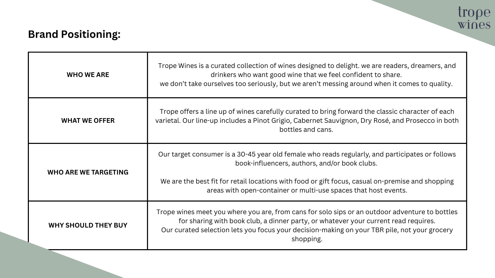
Brand Positioning: Consumer Focus, written for retailers and distributors.
This brand positioning framework is specifically designed to answer questions for distributor partners and retailers. Being specific on who the brand is targeting and best fit accounts isn’t about excluding others but ensuring that Trope is top of mind for spaces where the brand plays best. It’s a chance for external team members to continue internal work. If you’re going to target a specific demographic, make sure anyone talking about your brand knows who it is (if you think it’s obvious - it’s probably not). Make people’s jobs easier. They’ll reward you for it.
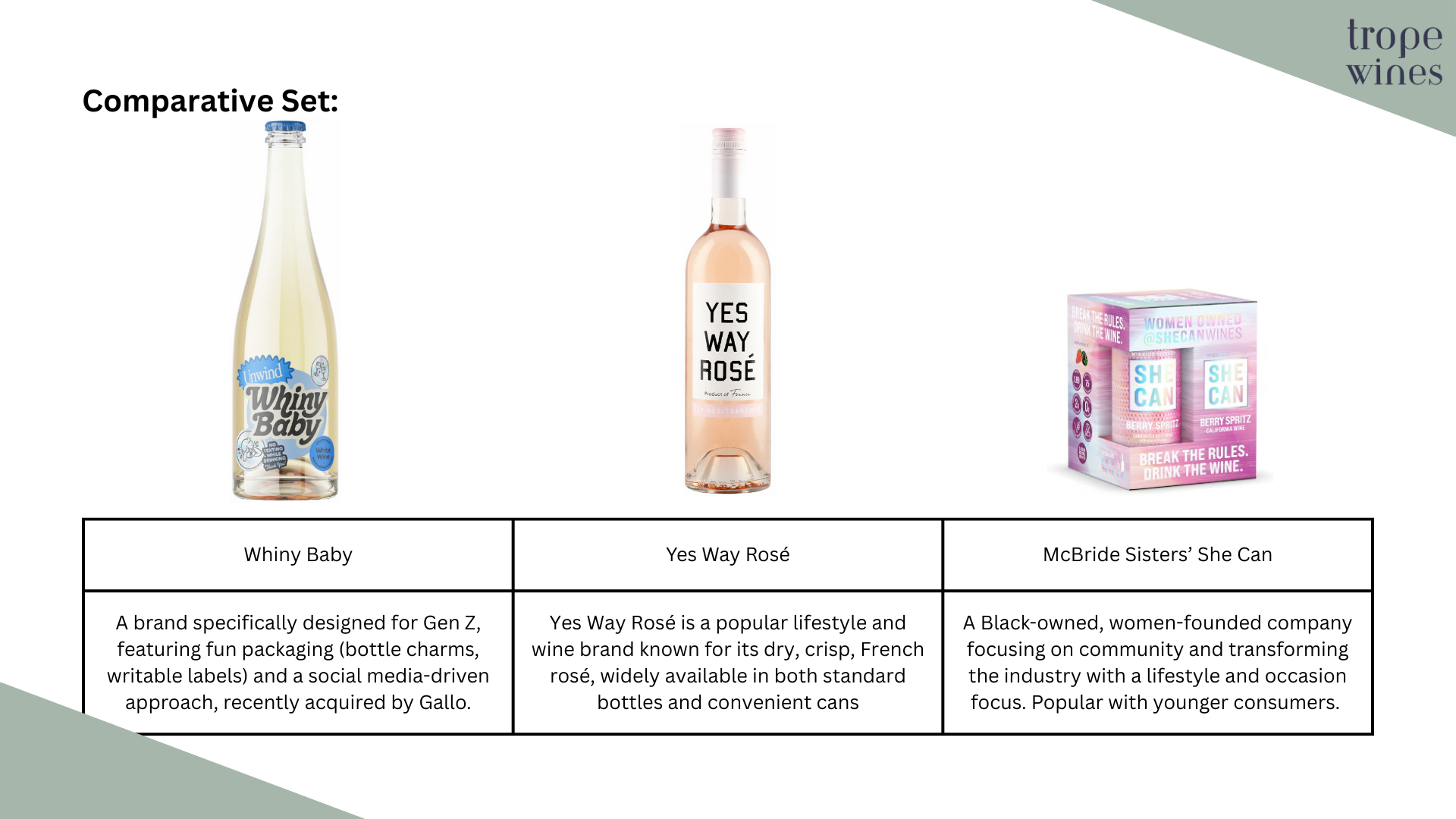
Comparative vs Competitive.
I’m not sure if this falls in to “hot take” territory, but comparative sets are better than competitive ones. First, most consumers (across CPG not just alcohol) aren’t 100% loyal to a brand. Second, distributors and retailers don’t want to see “buy this not that” when one is already on shelf. By creating a comparison, you’re building a set that will grab consumers attention.
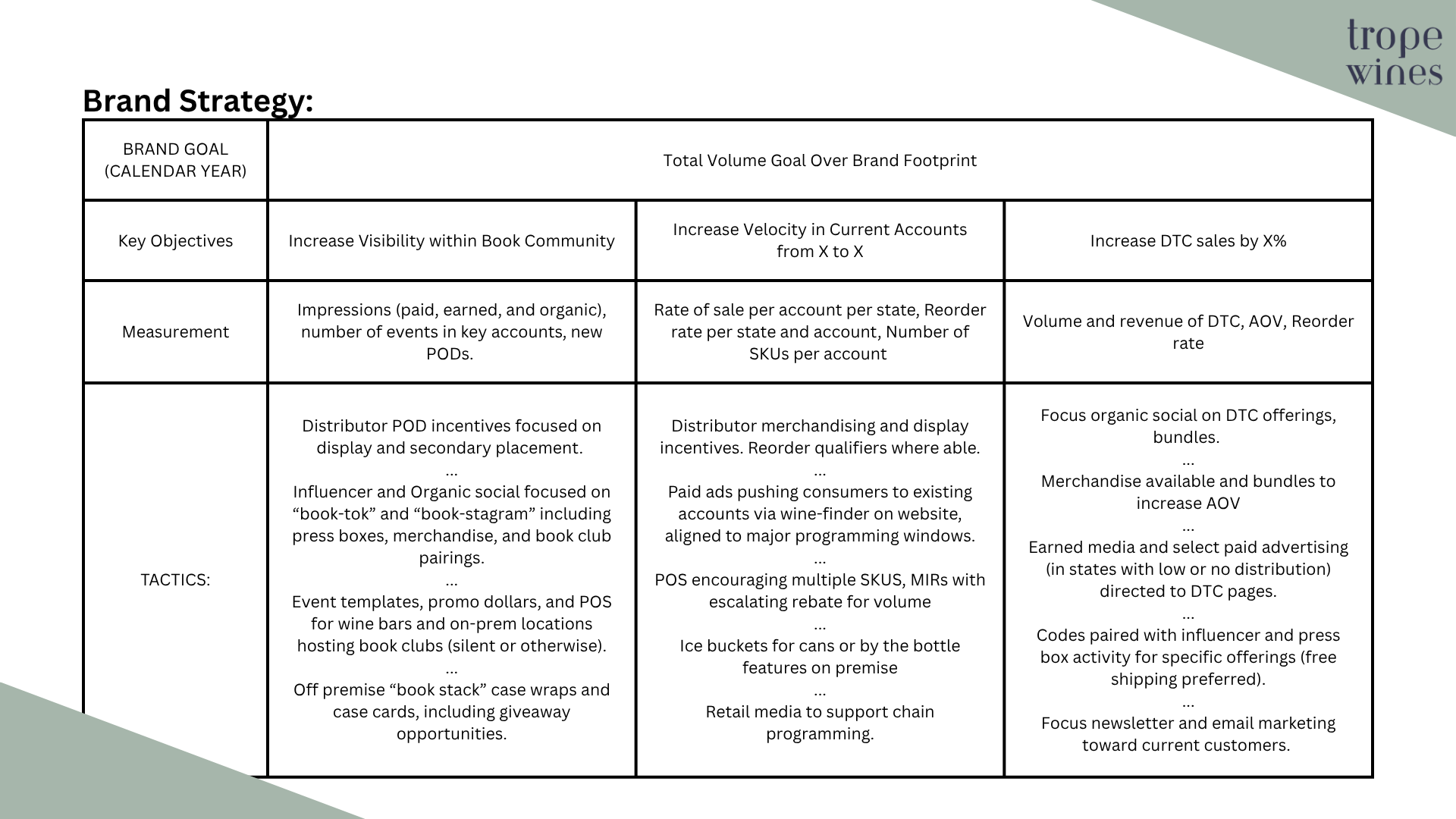
Brand Strategy - How Does Your Marketing Drive Business?
Instead of thinking of campaigns as “Awareness” or “Conversion” drivers, I think of tactics as laddering up to objectives and measured based on their role within the broader “Awareness - Interest - Desire - Action” process. This is because consumers are often interacting with brands across different tactics and steps in the customer journey (see my pinball analogy for more on that). This means I approach brand strategy by first identifying key objectives for the brand to address, and marketing tactics that support those objectives. This also helps teams work better cross-functionally - if a tactic (like velocity) is really shared across sales and marketing functions, individual members working toward the same goal are more likely to work together!
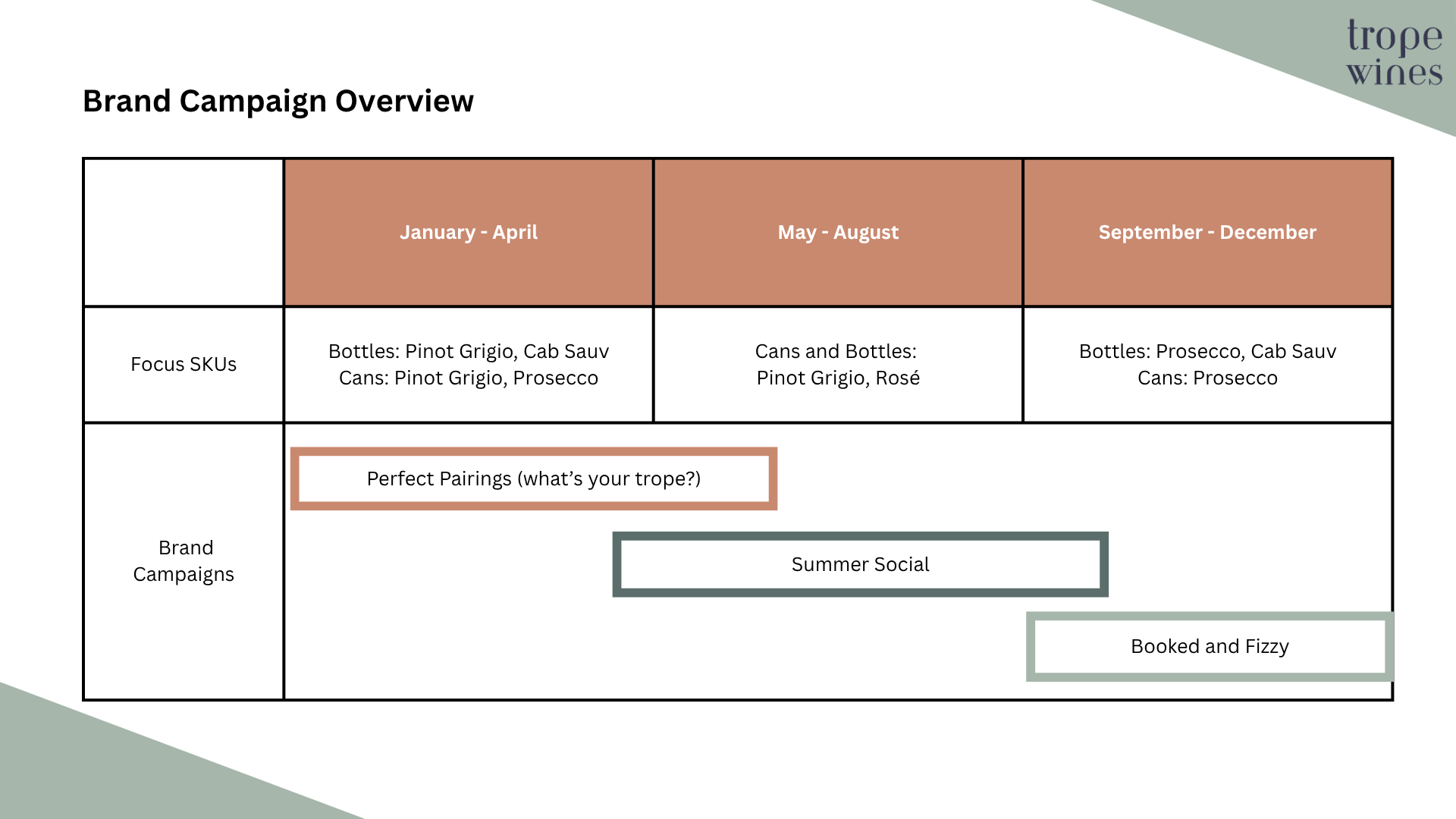
Brand Calendar
This is where tactics tend to layer on in a more message focused way (remember, everything within each time period is working toward the overall objectives). For trope, the messaging is obviously around occasion and also key SKUs based on seasonality. The messages above were specifically chosen for a broad enough time frame that sales has flexibility to implement depending on retailer needs, as well as enough overlap that messaging doesn’t suddenly feel dated after a specific date.
For example, Booked and Fizzy plays up Prosecco as a key SKU but the “booked” pun reflects the general calendar for people leading up to the holidays, and can lean into the “take a break with your book” moment or the “grab a bottle of trope as an easy hostess gift so you don’t have to think about it” message.
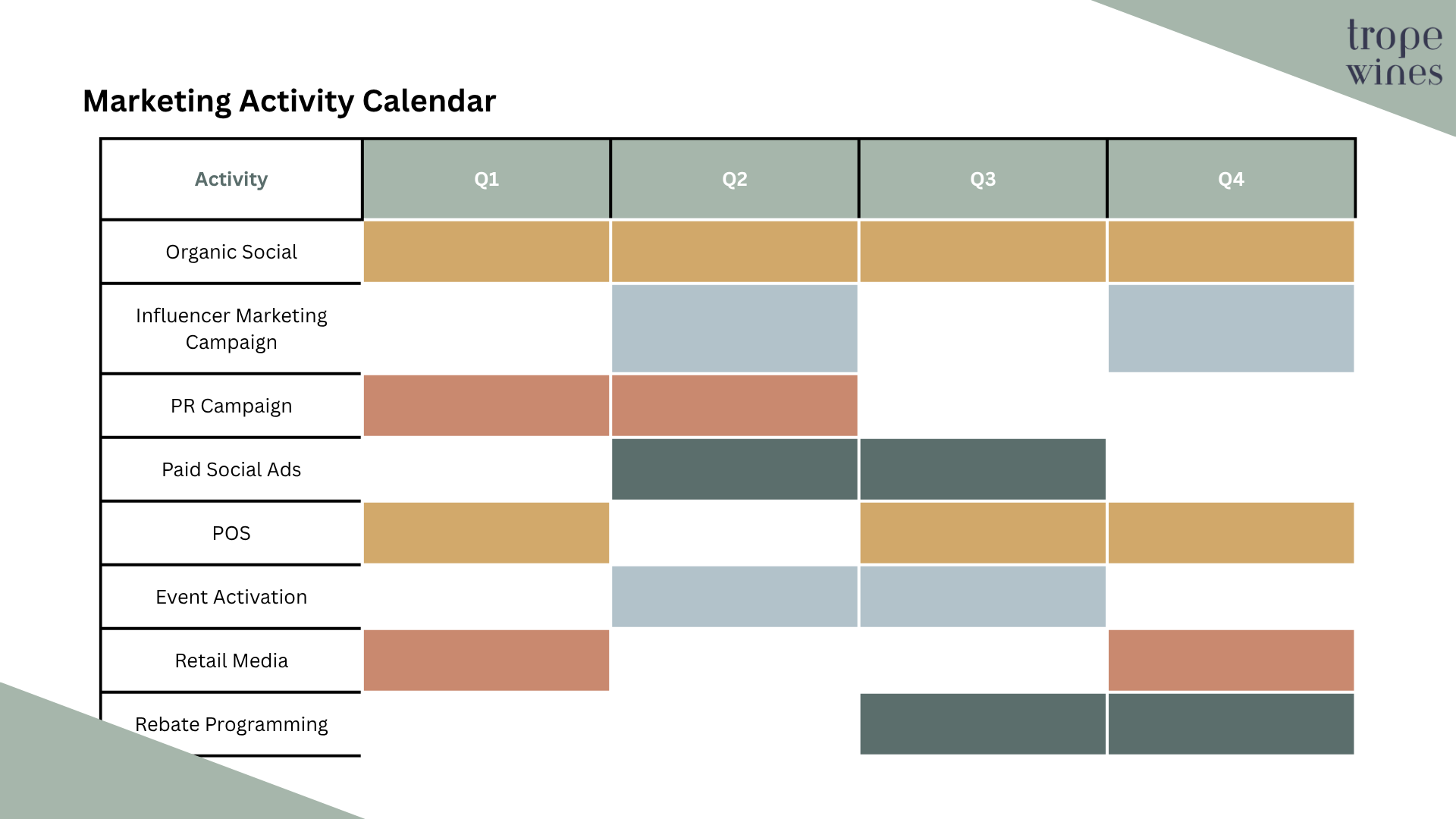
Activity Calendar
Messaging can cross tactics and time, but this slide is specifically designed to show retailers what the brand is contributing in terms of marketing and support.
A more in depth brand plan could include a slide by tactic for sales understanding and pitch support, as well as budget.
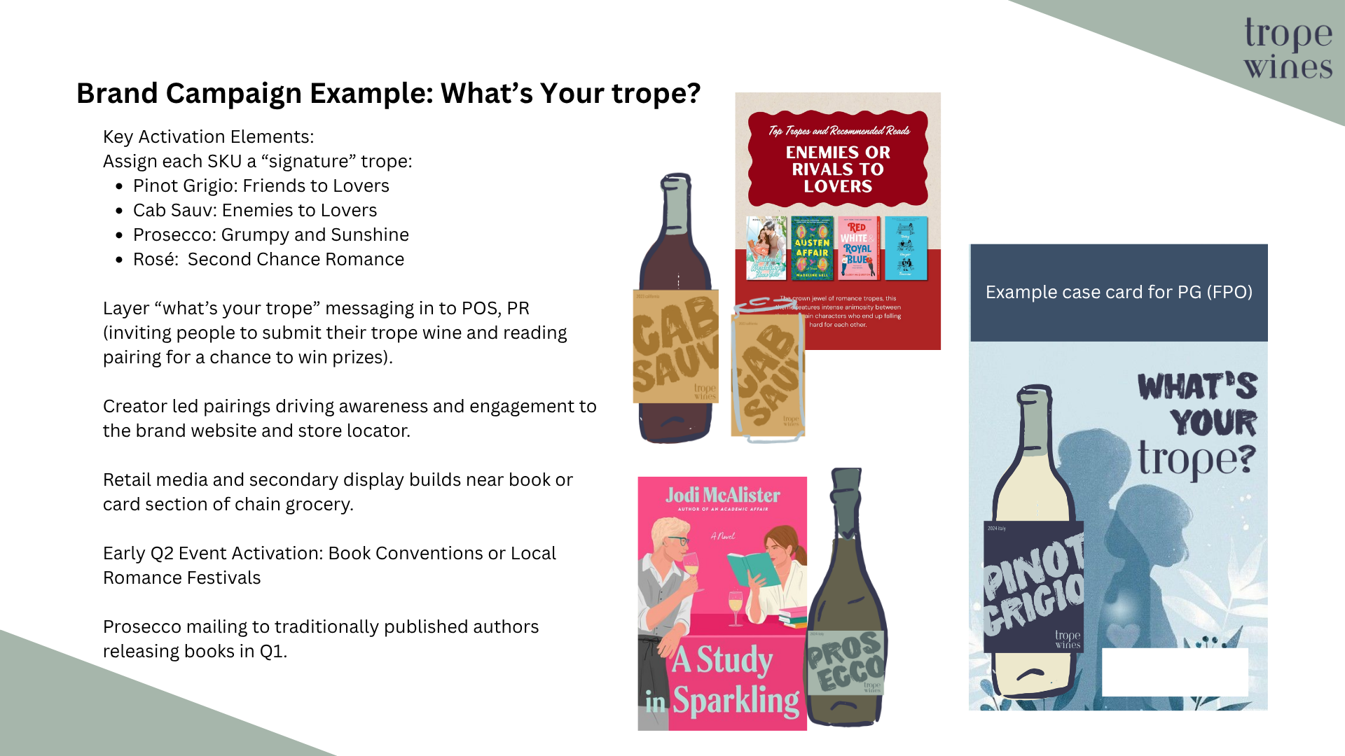
Campaign Example: Overview
As an example of a Campaign Overview, I would include the largest pieces of the campaign, along with key imagery (I am not a graphic designer, nor am I thrilled with AI generated art - so this would be updated in collaboration with a team or agency) and high level activation.
The goal of this slide is to give an overview of what is possible, and could (and should) be tailored to local teams.
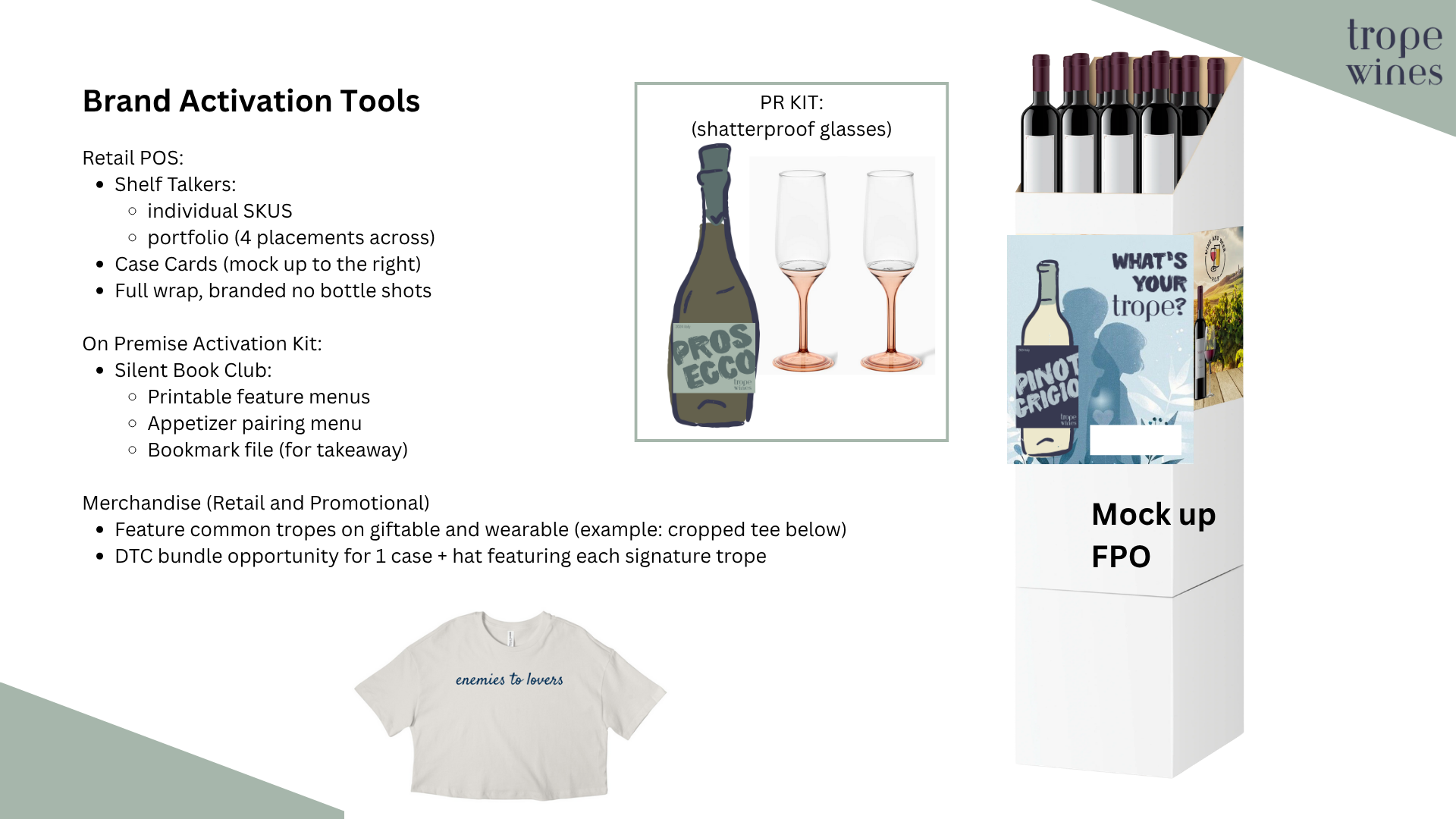
Campaign Example: Brand Activation Tools
This is an example of more detail that should be included with each brand campaign (this slide focuses around POS tools and merchandise, because… shameless plug… I wrote a book about it: The Merch Blueprint). The detail and demonstration of “what good looks like” is important to making the team’s life easier in pitching, and also avoid issues around execution that doesn’t align with brand standards.
Subscribe to my substack to see more of how I think about brand, strategy, and bringing a product to life: